
Choosing a glass splashback is often straightforward. Choosing the right colour or finish is where most homeowners pause.
Should you go bold or neutral? Match your cabinets or contrast them? Choose marble-effect glass or a solid tone? What works in a kitchen might not feel right in a bathroom.
If you’re researching before buying, you’re likely trying to avoid one thing: regret. A splashback is a visible, permanent feature. It needs to feel considered, not impulsive.
This guide explains how to choose the right colour or finish for your glass splashback, with practical advice tailored to modern UK kitchens and contemporary bathrooms.
Start With the Room, Not the Colour
Before looking at swatches or marble effects, take a step back and assess the space itself.
Ask yourself:
- Is the room light or dark?
- Is it large and open, or compact?
- Are the cabinets warm or cool in tone?
- Is the overall style minimal, traditional, or bold?
- A glass splashback should feel integrated into the room, not layered on top of it.
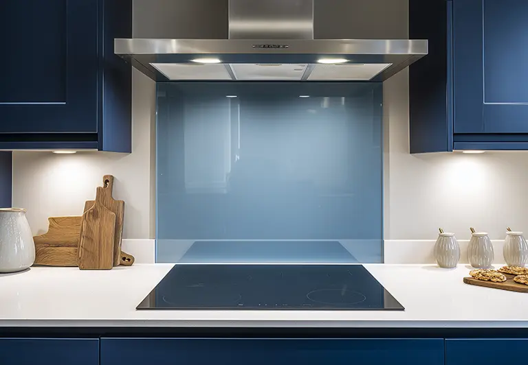
Neutral Glass Splashbacks: Safe Doesn’t Mean Boring
Neutral finishes remain the most popular choice in UK kitchens and bathrooms, and for good reason.
When Neutrals Work Best
Neutral glass splashbacks are ideal if:
- You plan to update cabinetry or décor later
- You prefer a calm, understated look
- You want broad appeal for future resale
- The rest of the room already has strong features
Popular neutral tones include:
- Warm white
- Soft grey
- Stone or taupe shades
- Subtle beige tones
In smaller kitchens or bathrooms, lighter neutrals can help reflect light and make the space feel more open.
Matching vs Contrasting
There are two common neutral strategies:
Match the cabinetry:
Creates a seamless, modern finish. Particularly effective in handleless or minimalist kitchens.
Contrast subtly:
A slightly darker or warmer tone than the cabinets can add depth without overwhelming the space.
Both approaches work well — the decision depends on whether you want your splashback to blend in or gently define the cooking area.
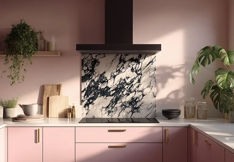
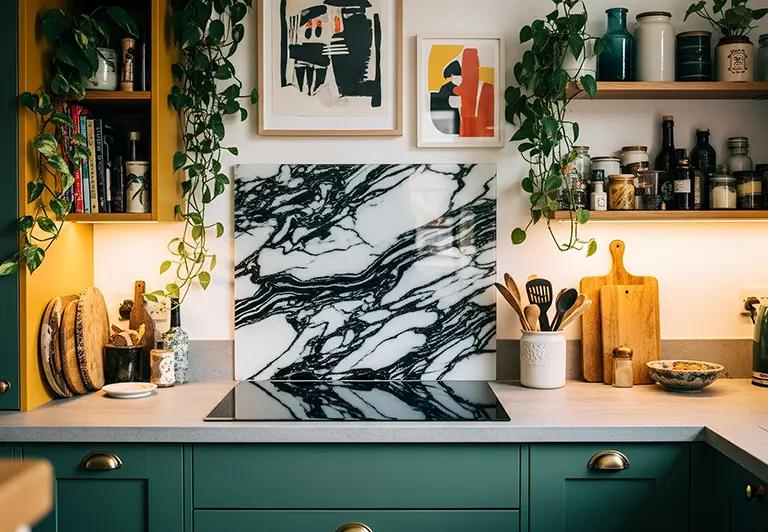
Marble-Effect Glass: Elegant and Versatile
Marble-effect glass splashbacks have grown in popularity, especially in contemporary kitchens.
They offer:
- The appearance of natural stone
- Easier maintenance than real marble
- Strong visual interest without busy grout lines
When Marble Works Well
Marble-effect finishes are particularly suited to:
- Modern kitchens with neutral cabinetry
- Luxury-inspired interiors
- Bathrooms seeking a spa-like feel
The key is balance. If your worktop already features bold veining, choose a more restrained marble pattern for the splashback to avoid visual overload.
If your surfaces are plain, a marble-effect splashback can act as a focal point.
Black and White Marble: Bold but Timeless
High-contrast black and white marble finishes create drama. They work best in kitchens that already embrace contrast — such as dark cabinetry paired with lighter surfaces.
In smaller rooms, strong marble patterns should be used thoughtfully to avoid overpowering the space.
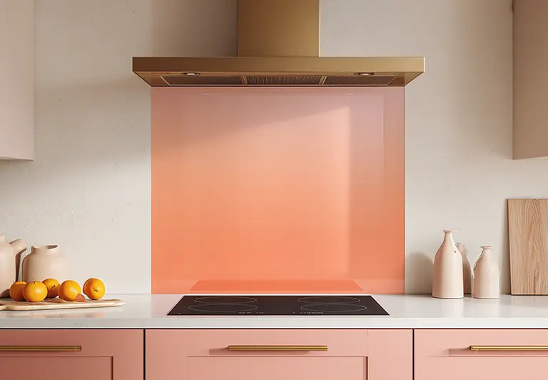
Coloured Glass Splashbacks: Adding Personality
Solid coloured glass splashbacks allow you to introduce personality without patterns.
Choosing the Right Shade
When selecting colour, consider:
- The undertones in your cabinetry
- Flooring colour
- Natural light levels
- Existing décor accents
For example:
- Deep greens complement warm wood and brass fittings
- Navy pairs well with white or grey kitchens
- Soft sage tones suit contemporary bathrooms
In general, mid-tones and muted colours tend to age better than very bright shades.
Bold Colours: When to Be Confident
Bold splashbacks can work beautifully in kitchens designed with intention.
They are best suited to:
- Statement kitchens with character
- Homes where colour is already embraced
- Open-plan spaces where the splashback becomes a design feature
If the rest of the kitchen is neutral and minimal, a bold splashback can provide controlled contrast.
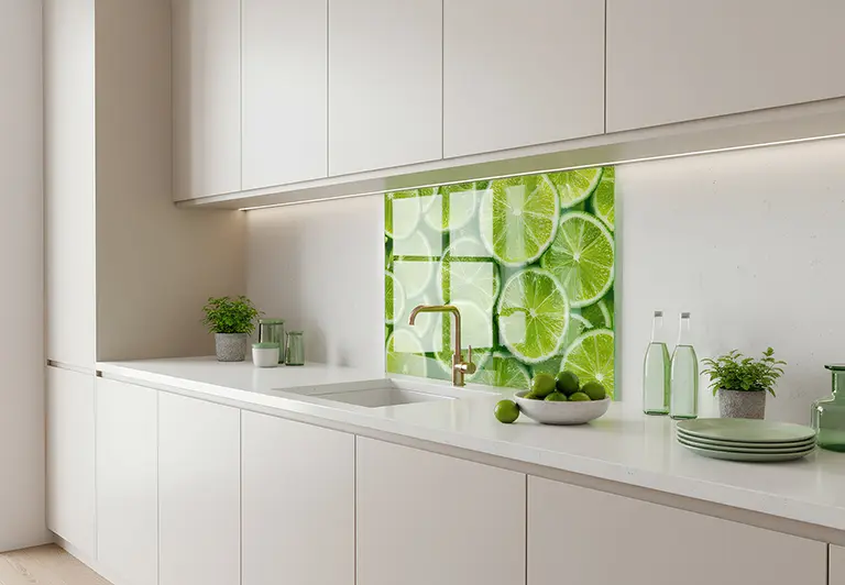
Printed Glass Designs: When Pattern Makes Sense
Printed glass splashbacks allow for creative expression — from abstract patterns to photographic designs.
However, they require careful thought.
When Printed Designs Work
Printed splashbacks are most successful when:
- The room itself is relatively simple
- The pattern aligns with the overall style
- The design has longevity, not just novelty appeal
For example, subtle textures, stone-inspired prints, or abstract forms tend to feel more timeless than trend-led graphics.
Avoiding Design Fatigue
Because splashbacks are permanent fixtures, overly busy or highly specific prints can feel overwhelming over time.
A useful test is this:
Would you still enjoy looking at this design every day in five years?
If the answer feels uncertain, consider a more restrained option.
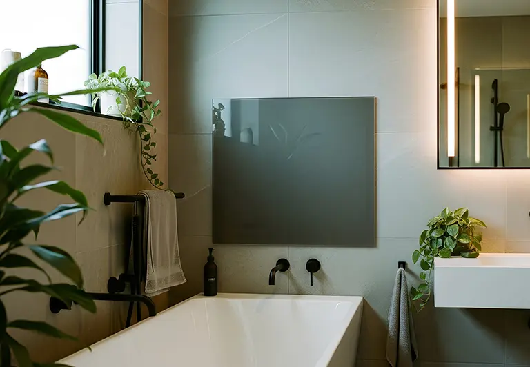
Glass Splashback Colour in Bathrooms
Bathrooms present slightly different considerations.
Light Reflection Matters More
Bathrooms are often smaller and rely heavily on artificial lighting. Lighter finishes or marble-inspired tones can help reflect light and prevent the room feeling enclosed.
Moisture and Cleanliness
Glass performs well in humid environments, and smooth finishes make cleaning simple. From a practical perspective, the finish choice won’t impact durability — it’s largely aesthetic.
For contemporary bathrooms, soft neutrals and gentle marble effects are often the most versatile options.
Common Questions Homeowners Ask
Should My Splashback Match My Worktop?
It can, but it doesn’t have to.
Matching can create cohesion, particularly in minimalist kitchens. Contrasting slightly can create visual depth.
If your worktop has heavy patterning, a simpler splashback often works best.
Will Dark Colours Make My Kitchen Look Smaller?
Dark colours can work in smaller kitchens if there is sufficient light. However, in low-light rooms, darker splashbacks may absorb light rather than reflect it.
Consider how much natural light the room receives before choosing deep tones.
What If I Change My Kitchen Later?
Neutral and marble-effect finishes are generally more adaptable. If you anticipate updating cabinetry in the future, choosing a flexible splashback colour can reduce limitations later on.
How to Make a Confident Decision
Choosing the right glass splashback colour isn’t about trends — it’s about harmony.
Before finalising your choice:
- View samples in natural and artificial light
- Compare against cabinet doors and worktops
- Consider how the room is used daily
- Think long-term rather than short-term impact
A splashback should feel intentional, not experimental.
Final Thoughts
There is no single “best” colour for a glass splashback — only the one that works for your space.
Neutral tones offer flexibility and longevity. Marble effects add refinement and texture. Solid colours introduce personality. Printed designs create statement moments when chosen carefully.
By assessing your room honestly and considering light, balance, and long-term appeal, you can choose a finish that feels right not just today, but years from now.
For those exploring options, reviewing a range of finishes and collections can help clarify what feels aligned with your home and lifestyle.
A well-chosen glass splashback quietly enhances a kitchen or bathroom — and when it’s right, it simply feels like it belongs.